An interface should be understood, not admired
An interface is not there to be admired, it is there to take the user where they are going by the shortest route. If someone has to stop and work out what to do, the problem is not the colour or the typeface, it is the flow.
We start by looking at what people are after and where they get stuck. Then we build the screens around that behaviour and tie every decision to a design system. When a new page is needed later, nothing gets redrawn from scratch because the rules are already written.
User research
Who comes in, for what, and on which device. We start with the data at hand, not with assumptions.
Flow and information architecture
Which screen leads where, and in how many steps. The longer the path, the more people abandon it.
Design system
Colour, type, buttons and form rules live in one place. The language holds even as the team grows.
Usability testing
The design is tried with real people before launch. Where they stumble is observed, not guessed.
UI & UX Design
How the screen works, not just how it looks.
- 001User flow and screen map
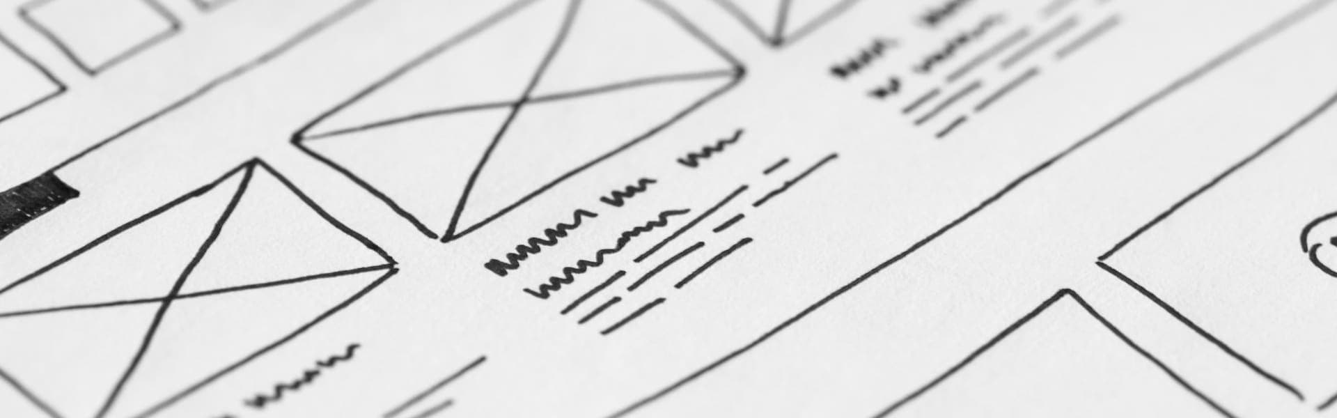
- 002Wireframes
- 003Interface design and component library
- 004Mobile and desktop breakpoints
- 005Clickable prototype
- 006Developer handoff file
(01)DISCOVERY
The product goal, the audience and today's problems are put on the table.
(02)RESEARCH
User behaviour, competing screens and any measurement data are reviewed.
(03)FLOW
Screens and the path between them are mapped, wireframes are drawn.
(04)DESIGN
The interface and design system are built, components named and documented.
(05)TEST AND HANDOVER
It is tested with real users, corrected and handed over ready for development.

Let us talk about your business.
The first conversation is free and you are not obliged to buy anything. We work out what needs doing, then continue with a written proposal.